4 Image Hacks for Improved Visual Storytelling on Presentation Slides
If you use images to tell your story, you’re already one step ahead of the majority. I speak on behalf of every bored conference attendee and every person who has clicked off a texty website that:
There’s nothing more refreshing than a well-chosen image to complement your message.
To boost your slide or website design even further, here are a few image hacks (backed by human behavior) guaranteed to level up your visual storytelling.

1. Choose HD and go full-screen with images
Images don’t always need to appear like a rectangular island floating on your slides next to an ocean of text boxes. If you have access to a high-resolution image, blow it up to fill the screen.
We smash that ‘full screen’ button on Netflix and YouTube for a great user experience. Why not bring some of that to our audience? It’s only human to want a grand HD visual.
An appealing image spanning across the whole slide instantly draws your audience into the scene, much like at the movies, capturing their undivided attention. Any text additions can go over the image.
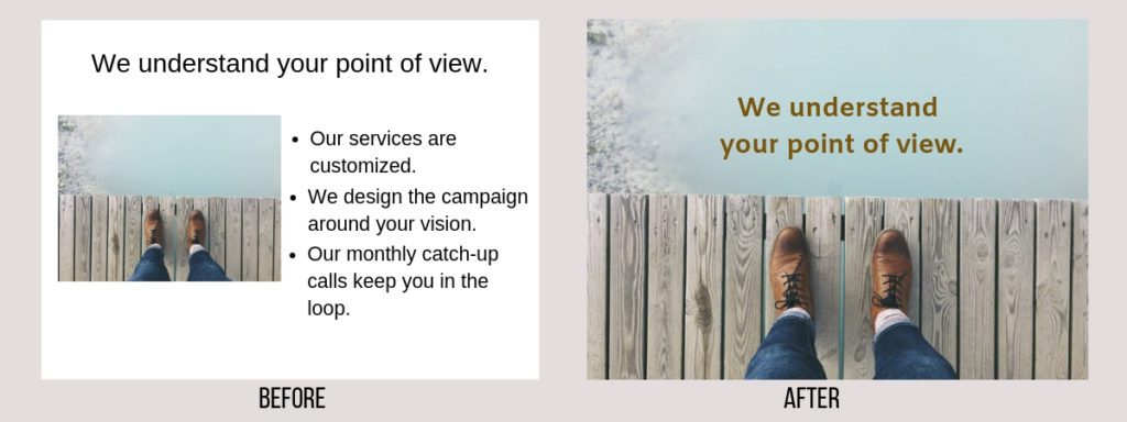
For a better audience experience, consider making your images full-screen. Based on the human behavior of automatically making videos and movies full screen on our laptops or phones, seeing a high-quality image span across the screen will draw your audience’s attention.
WATCH THE VIDEO
2. Follow the eye gaze
I don’t intend to get all romantic, but it’s all in the eyes, baby.
The eye gaze, especially one that stares directly at your audience, has the power to capture and hold their attention.
So, here’s the problem: If the image on the slide has a model looking directly at the audience, their eye contact with you will be lost. You will also lose their attention for a little bit.
You’ll notice that people in the audience keep looking at the image instead of looking at you. No offence.
It’s human behavior to gravitate towards an eye gaze that stares directly back at you.
Here’s the solution: Choose an image where the model looks to the side or is in action. This way, you can put your message on the pedestal without those distracting eyes stealing away your audience.

In the left example, your audience will stare more at the face, the eyes and the photograph of the stock image because it directly stares back at them. Those darn eyes! Whereas in the right example, your audience will toggle between the image and the text. If you’re presenting important information on your slide, consider a stock image with a side gaze.
In an eye tracking study, 160 people looked at two images, one with direct eye contact and another with a side gaze, both appearing alongside text.
Upon tracking the eye movements of each participant, the heat map showed sustained attention on the face in both cases. When the baby’s eyes made direct eye contact, there was less attention on the supporting text. However, when the baby struck a side gaze, there was more attention on the text.
The participants tended to follow the gaze of the baby, looking more at the text in the second instance.
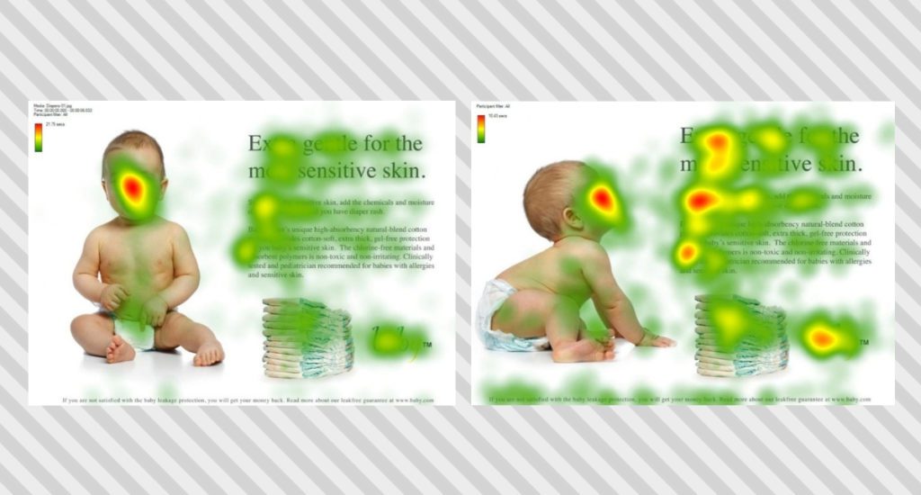
In an eye tracking study with 160 participants, the data showed that there was more attention on the text when using an image with a side gaze. Image and data courtesy of James Breeze.
3. Use the power of direct eye contact to persuade
On the flip side, you can also use the power of those eyes to persuade or spark action from your audience.
For example, if you’re making the case for protecting animals at a local zoo, using an image where the animal makes direct eye contact with the audience will amplify your message and leave them feeling connected with the animal. Those donations aren’t far away!
If you’re speaking to inform, put the message on the pedestal and use supporting images with a side gaze.
If you’re speaking to persuade, use images with direct eye contact to spark action.
In summary: When picking stock photos, watch out for those eyes and let your overarching message dictate your image choice.
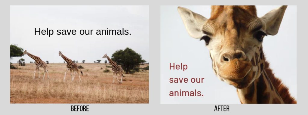
If you’d like to spark action from your audience, use the power of direct eye contact to make tangible connection with your audience. In the left image, the audience understands what you’re saying, while in the right image, they feel your message.
You’re more likely to get calls for adopting Bella if you show her beautiful, persuasive eyes. I mean, who can resist that?

4. Position text in the direction of eye gaze
If you’ve chosen an image where the subject looks away from the visual scene, I need to inform you of another human trait – our eyes follow the gaze.
If the subject looks to the right, you’ll need to place text boxes on the right side of the slide. This makes the flow of information much more natural for your audience.
This concept also holds true for images where the subject appears to be in motion, say an athlete running or a duck swimming. Place text or other supporting elements along the direction of movement for a better visual story.

When your slide has an image with a face, your audience will first look at the face. Their second reaction will be to follow the gaze. In the left example, the gaze leaves the page, making the text placement on the left appear unnatural. Whereas, the right example creates a more harmonious experience: audience looks at the face, follows her gaze, and voila, there’s the text.

By merely flipping where JFK looks, you create a more natural eye flow for your audience to follow along.
Slide design is a form of art. Data from human behavior and science can guide your decisions to get particular outcomes, but if there’s a certain design that speaks to your heart, go for it! Your comfort with your designs will only make the story more authentic.
I hope these hacks help you tell a more visually engaging story. Happy designing!
Anita

